
As a newbie, the cryptocurrency world can be a bit intimidating. There are a plethora of buzzwords to learn, and once you’ve mastered those, the charts come out. The charts go on and on and on.
When used correctly, these charts can be an invaluable resource for anyone hoping to become a full-fledged analyst in cryptocurrency trading. Charts are an important part of many traders’ decision-making process.
What Is A Crypto Chart?
The crypto chart is simply a visual representation of data that can help you better understand the movement of cryptocurrency prices.
As trends emerge, patterns in the data can help you see how the market is moving – whether it is bullish (people are buying and prices are rising) or bearish (price is falling and people are selling). As a result of this, it is hoped that you will be able to predict the market’s future direction and price, and thus know when to buy, sell, and hold.
Ways To Read Crypto Charts
In the world of price charting, line charts and candlestick charts are the two most common formats.
1. Line Charts
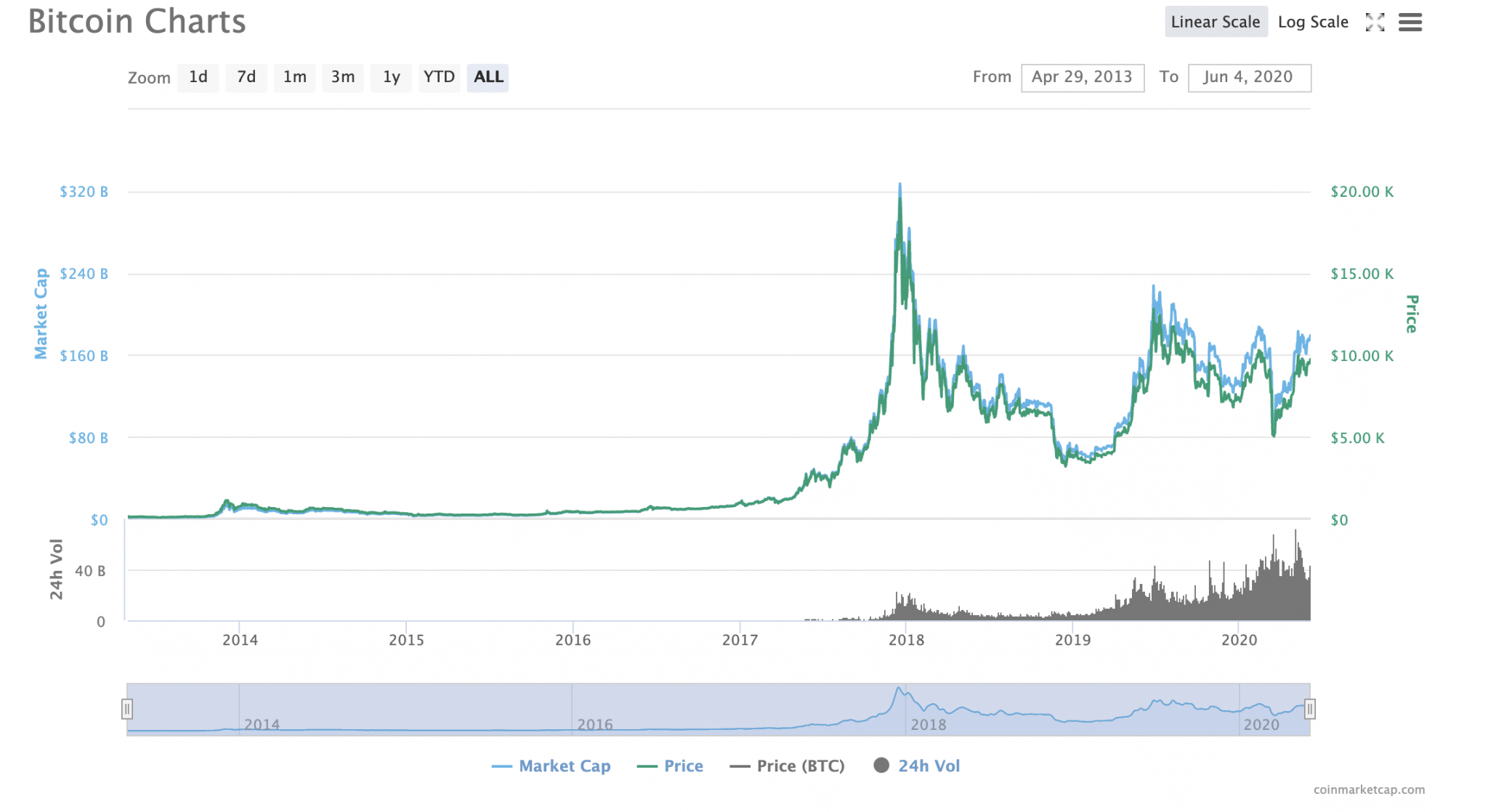
A Linear Chart
In terms of cryptographic charts, line charts are the most basic. An asset’s historical price points can be seen on a line chart. To see it in action, look at the graph above. Here, the price of Bitcoin (BTC) is represented by the right-hand scale in US dollars (though it can display any local currency). Cryptocurrencies typically have daily closing prices based on a specific period.
Chart viewing time frames can be set to any desired length, be it minutes, hours, days, weeks, months, or even years in the future. Minutes and hours tend to be the preferred time frames for experienced traders. If you’re a long-term investor, monthly is the best option for you.
Line charts are available in two different scales: linear and logarithmic, which you should keep in mind when interpreting them. Toggling between them makes it simple to do so (top right-hand corner of the graph above, but this will vary).
As the name suggests, a linear chart divides the price scale into equal segments. Using a log chart, the price of a cryptocurrency is scaled based on percentage changes, so if two price changes are different in absolute value but equal in percentage, they will both be represented by the same vertical shift on the graph. It is possible to use both charts.
The speed of price changes can be better assessed using a linear chart, whereas trends can be more easily identified using a log chart.
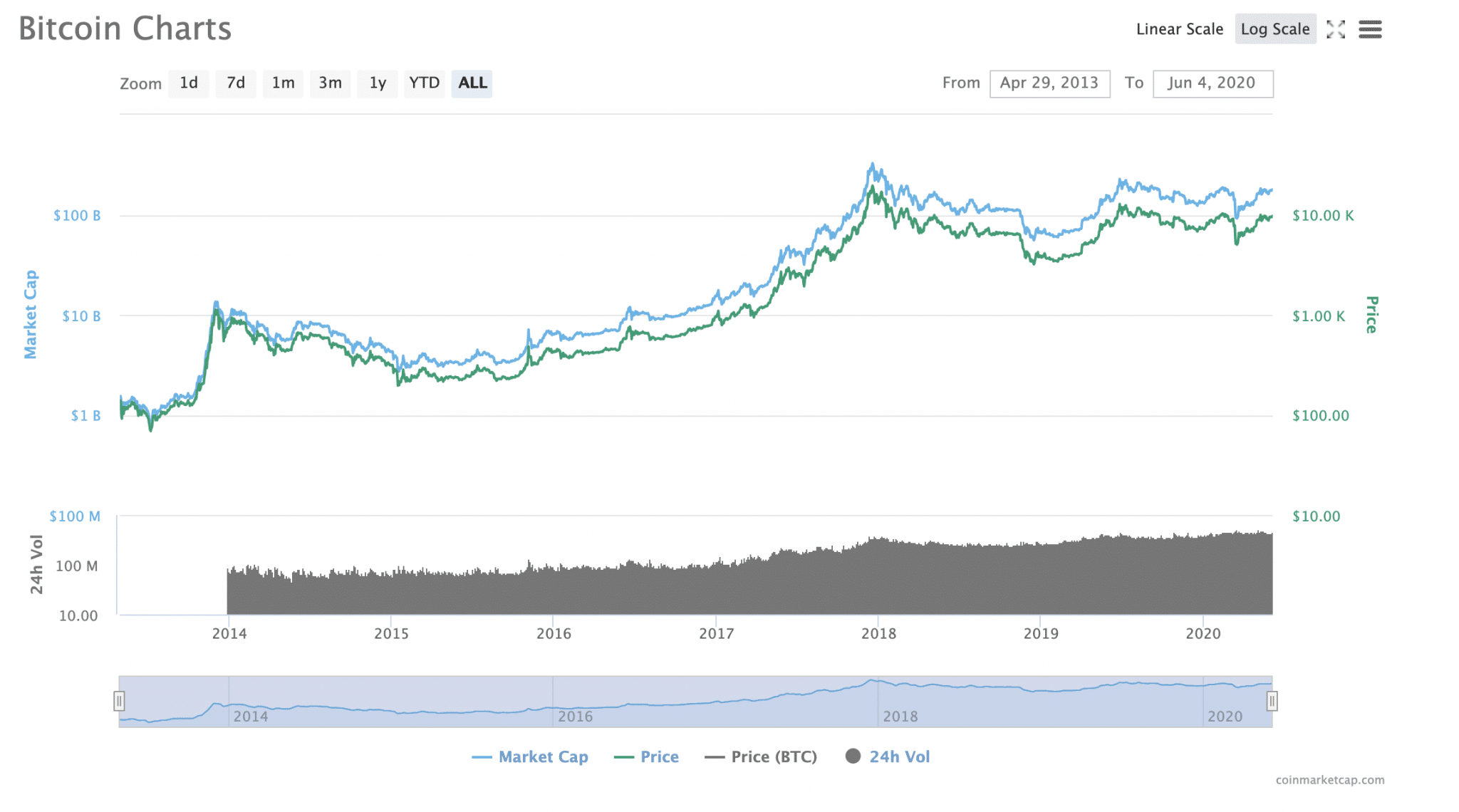
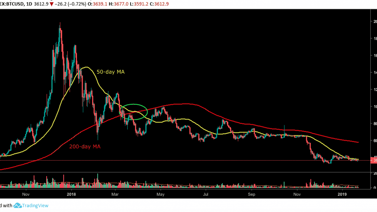
A Logarithmic Line Chart
The market capitalization of Bitcoin is represented by an axis on the chart’s left side. The blue line illustrates this. The market cap of Bitcoin is simply the total value of all the Bitcoin that has been issued. The total number of Bitcoins in circulation is multiplied by the Bitcoin price to get the value. In other words, it’s a good indication of how investors currently view Bitcoin.
A black line at the bottom of the chart indicates the volume of trading over the previous 24 hours. To gauge whether or not a rise in prices can be sustained, it is useful to look at this. This means that a surge outbreak built on weaker foundations will be more likely to collapse straight back down if the volume is low.
In the meantime, higher volume increases the likelihood that an upward price swing has some real momentum.
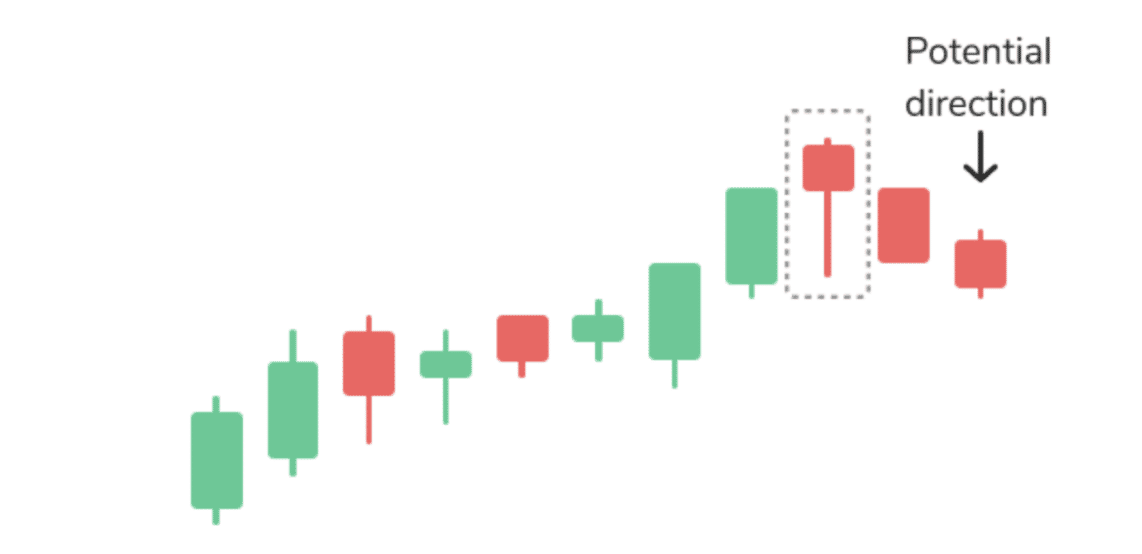
2. Candlestick Chart
Additional information can be found in the candlestick chart, which is a more advanced trading tool. As a tool for technical analysis, it is widely used by cryptocurrency traders.
As intimidating as candlestick charts appear at first, understanding them is simple once you get the hang of it. The time is plotted on the x-axis, while the price is plotted on the y-axis. That’s a lot like the line chart, right? Candlesticks are a big difference.
The term “candlestick” refers to the shape of each candlestick on the graph. Red (or pink) or green rectangles with a line coming out of the top or bottom like a candle’s wick. The wick, the length of the candlestick, and the color of the flame all reveal information about the candle.
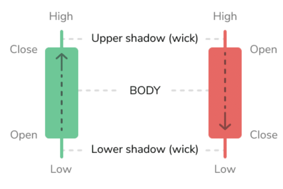
An opening-to-closing balance discrepancy for that coin is shown by a rectangle in the chart. When a cryptocurrency has green candlesticks, it indicates a rise in value, which means that both the opening and closing prices are at their highest points.
The opening price is at the top, and the closing price is at the bottom, as indicated by red (or pink) candlesticks. As a result, you may occasionally see symbols that appear to be crosses or even plus signs. For traders, this is what is known as a doji, which means the day’s opening and closing prices were the same.
The “wicks,” on the other hand, emerge from the rectangle from either the top or bottom of the rectangle. These represent the day’s highest and lowest price points. The more volatile the market, the more likely it is that your coin’s gains or losses of the day will continue or be reversed on the next trading day, according to technical analysis proponents.
As a result, it reveals whether or not the market is expanding downwards more quickly than it is expanding upwards.
Imagine a situation in which the wick at the top of the candle is extremely short. Considering the coin’s closing price was near its day’s high, this suggests it is doing well. An indicator of how much people were willing to pay for the coin would be a long, drooping wick at the top of the coin’s value. Thus, a decline or a shift to the bearish side of the market is in the offing.
To put it another way, investors want to buy a cryptocurrency when it is at its lowest possible price, which they believe to be right now. As a result, there could be future upward trends.
If the wick is long at the bottom of a candle, it indicates that the coin is still being sold. As a result of the increase in supply, the price is likely to fall even further. That being said, an extended candlestick indicates that the coin’s value has already dropped and buyers are eager to get their hands on it while it is at its lowest point. This could lead to a rise in the following day’s prices.
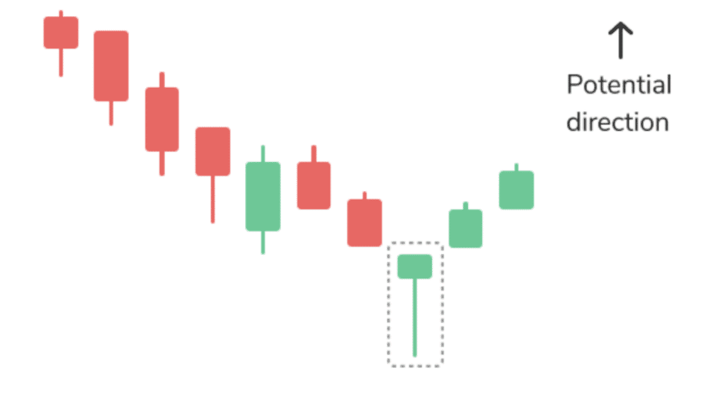
The hanging man is an example of a bearish candlestick pattern. When the upward trend ends, the closing price is lower than the opening price, which is similar to a hammer formation.
3. Moving Averages
Moving average indicators are another common line you will see on cryptocurrency charts. Coin closing prices over the specified period are used to calculate these lines. An excellent tool for spotting trends, this indicator can also be used to help identify signals for entering and exiting positions.
A 50-day moving average is calculated by summing the closing prices of a coin over the previous 50 trading days and dividing it by 50.
Conclusion
This is an introduction to crypto charts and investing in Bitcoin and other cryptocurrencies. Traders can benefit from using one or more of the methods listed above, but they should also conduct additional research.